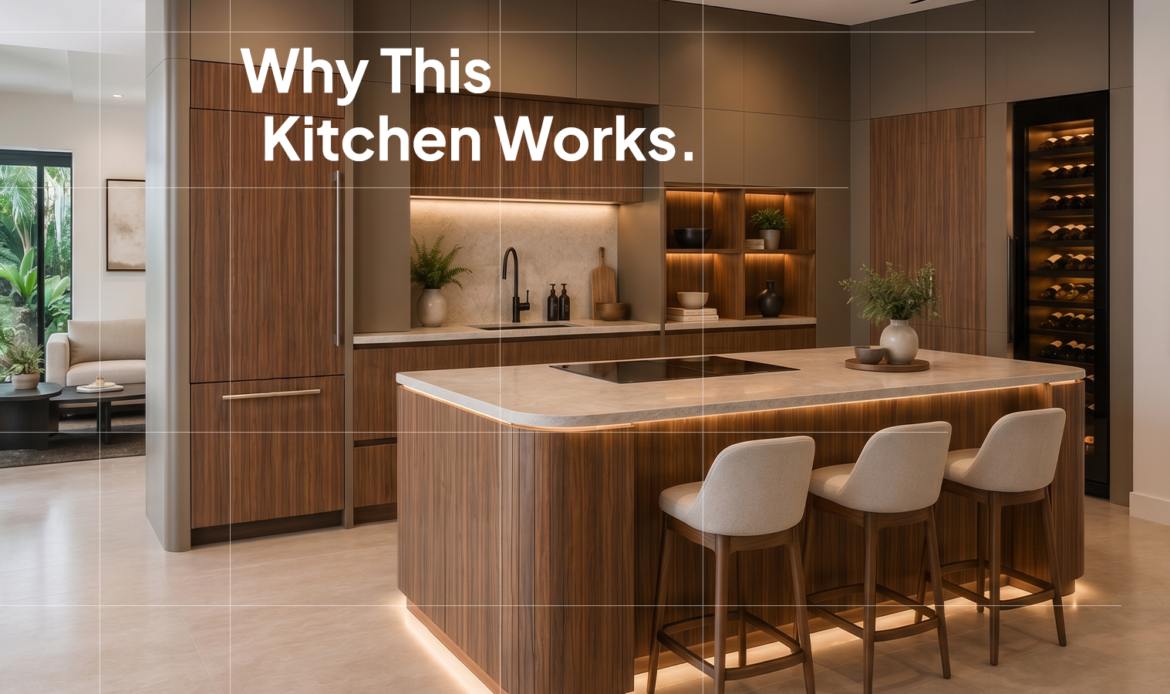
Some kitchens are all about bold finishes and attention-grabbing features. This modern kitchen design shows how intentional decisions across layout, materials, storage, and lighting create a calm, functional, and timeless space. At Maple Haus USA, we treat the kitchen as an architectural interior system—not just cabinetry and appliances—so every element supports how the space looks, works, and feels over time.
The Big Idea: Intentional Design Over More Features
The guiding idea behind this project is simple: a successful kitchen isn’t defined by how much you add, but by how well everything works together. Instead of chasing trends or stacking features, the design leans on restraint, proportion, and consistency to keep the room visually quiet even when it’s in use.
This approach also makes life easier for project teams. Clear geometry and coordinated details simplify engineering, shop drawings, and installation. And because the layout and material palette are grounded rather than trendy, the kitchen still feels current years from now, not just in this season’s design cycle.
A Cohesive Material Palette
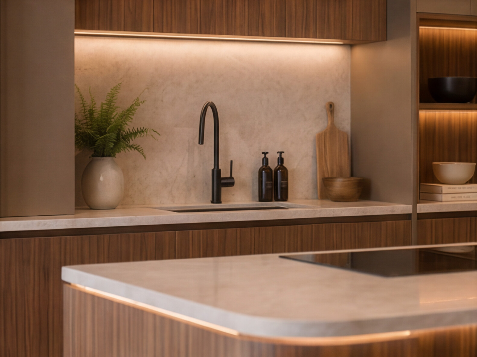
This kitchen is built around three core materials: warm walnut veneer, matte taupe panels, and light stone surfaces. Each material plays a specific role—walnut brings warmth and texture, taupe creates a quiet backdrop, and light stone keeps work areas bright and durable while tying the perimeter and island together.
Because the palette is restrained, the eye moves along the horizontal lines and wrapped corners instead of bouncing between competing colors and finishes. That kind of consistency doesn’t just look good; it also makes it easier to coordinate adjacent spaces, flooring, and wall treatments during design and construction.
Storage Without Visual Clutter
One of the first things people notice in this kitchen is what they don’t see. There’s no busy appliance wall, no cluttered shelving, and very few visual interruptions along the perimeter. The room feels quiet, even when it’s working hard.
That calm comes from a few deliberate choices:
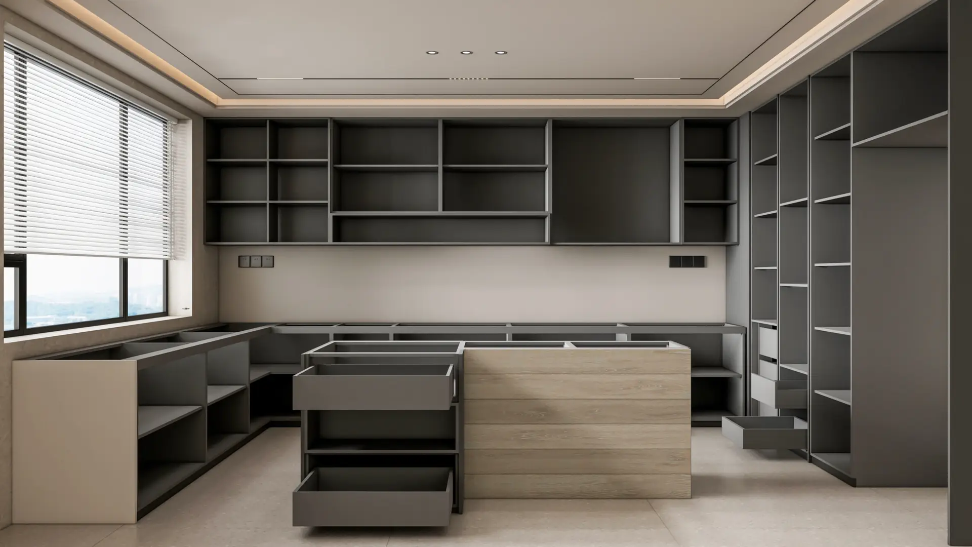
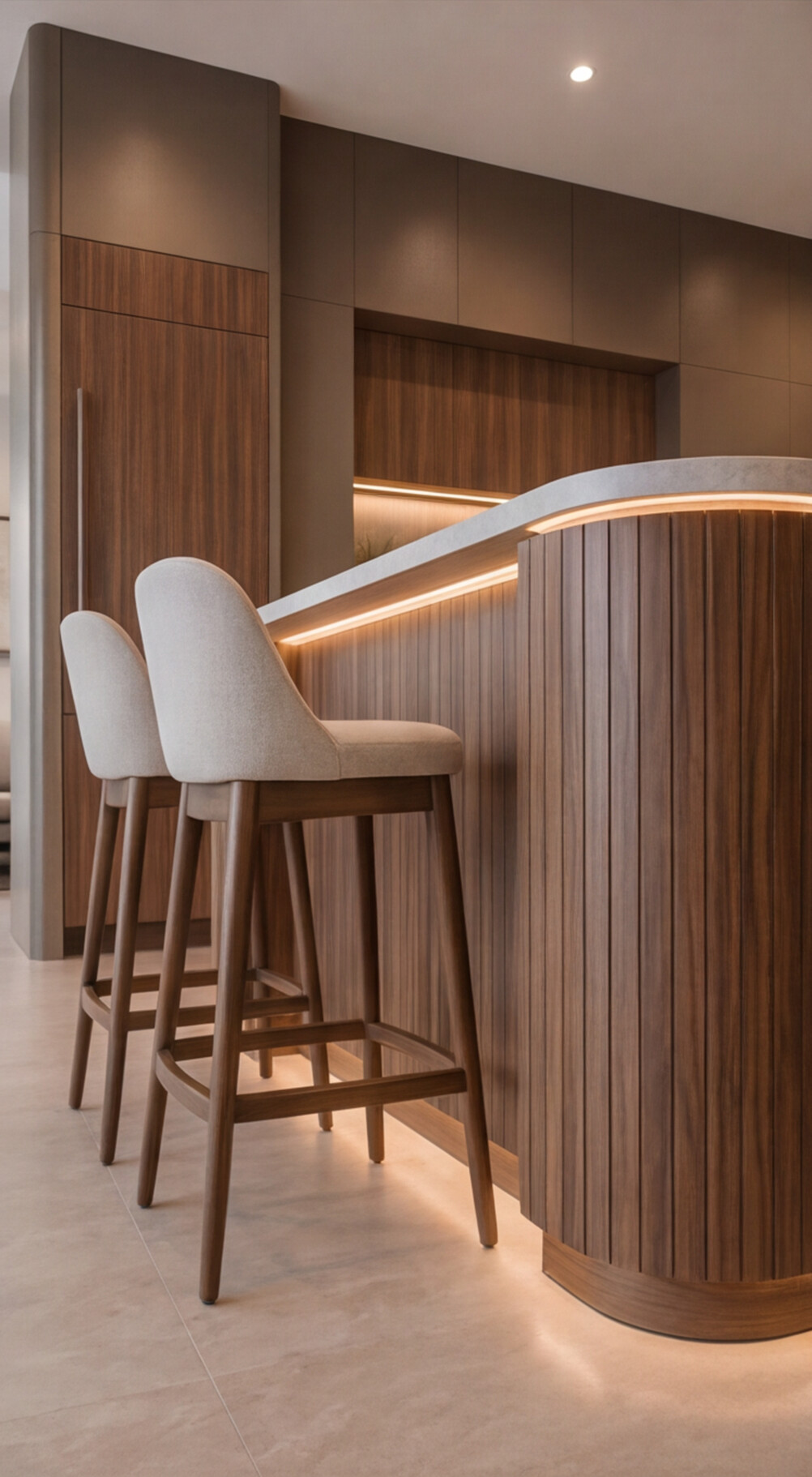
- Cabinetry runs to the ceiling, increasing storage while making the elevation feel architectural rather than modular.
- Large appliances are concealed behind matching fronts, shifting attention back to the lines and materials of the room.
- Tall panels wrap specific work zones—like the concealed coffee station—so everyday tools can disappear when they’re not in use.STORAGE.jpg+1
For builders and installers, full-height systems and integrated fronts reduce exposed transitions and trim improvisation on site. For the people using the kitchen, it simply feels organized, even on a busy morning.
One Island, Four Functions
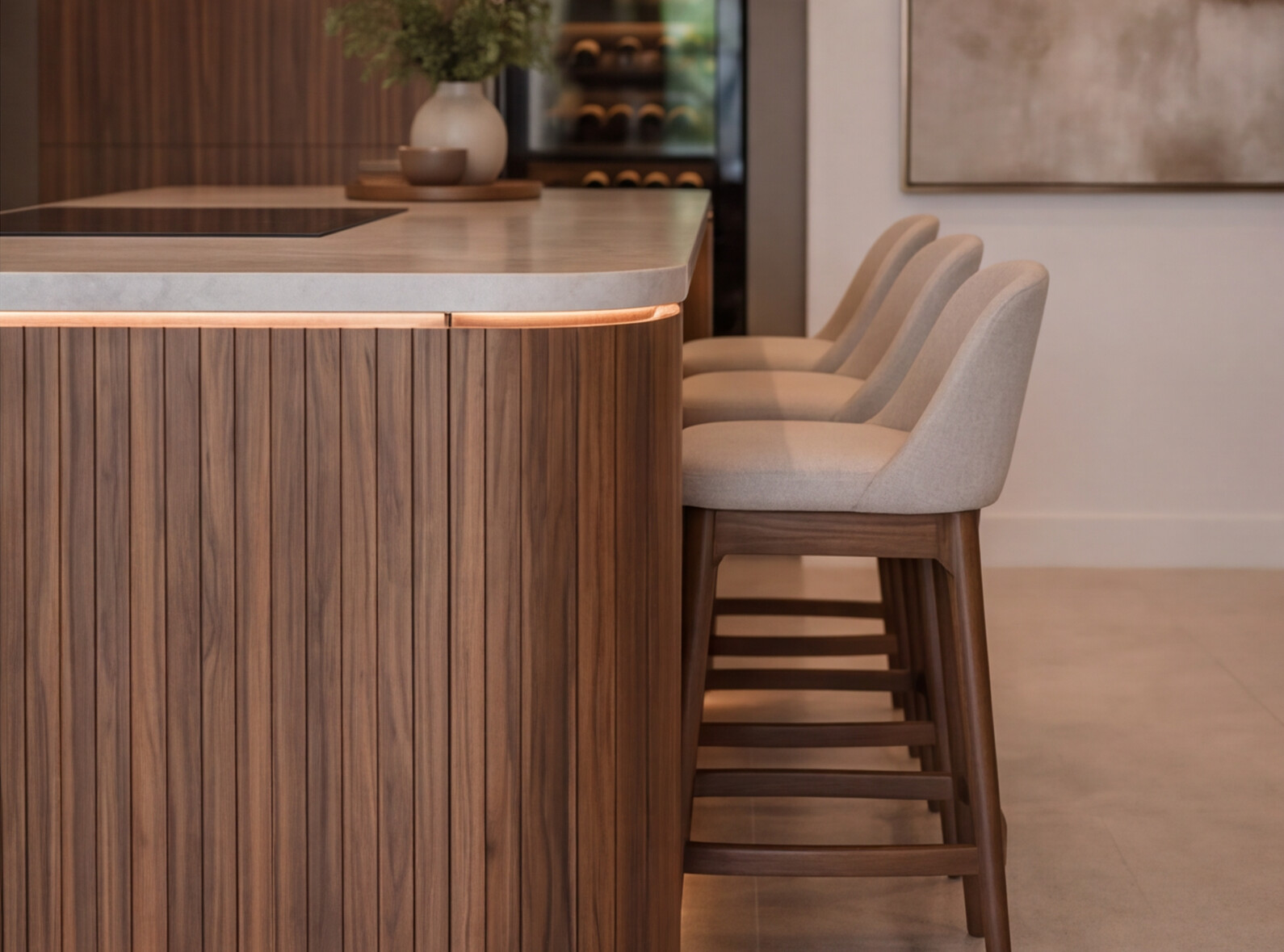
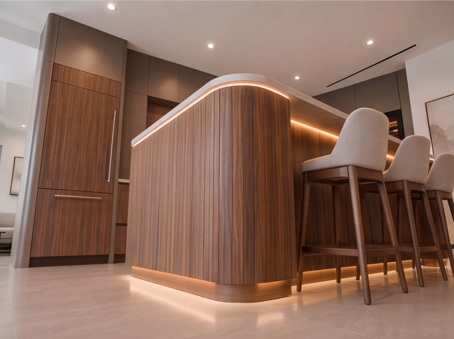
The island is the anchor of this kitchen, and it quietly does most of the work. Instead of treating it as a single-purpose surface, the design turns it into the everyday center of the home.
On a typical day, the island becomes:
- A generous prep surface with clear access to the sink and cooktop.
- A cooking zone that keeps tools and ingredients within reach.
- A dining area for everyday meals and quick conversations.
- A natural gathering spot as circulation wraps around it from every direction.
By concentrating activity into one well-planned centerpiece, the layout creates the feeling of a large, generous kitchen without pushing square footage. For developers and architects, that kind of multi-functional island design is a practical way to add value within the same footprint.
Layered Lighting That Adds Depth
Lighting plays a major role in how this kitchen feels, but it never tries to become the main event. Instead of one bright layer, the design uses several quiet layers that work together.
The lighting strategy combines:
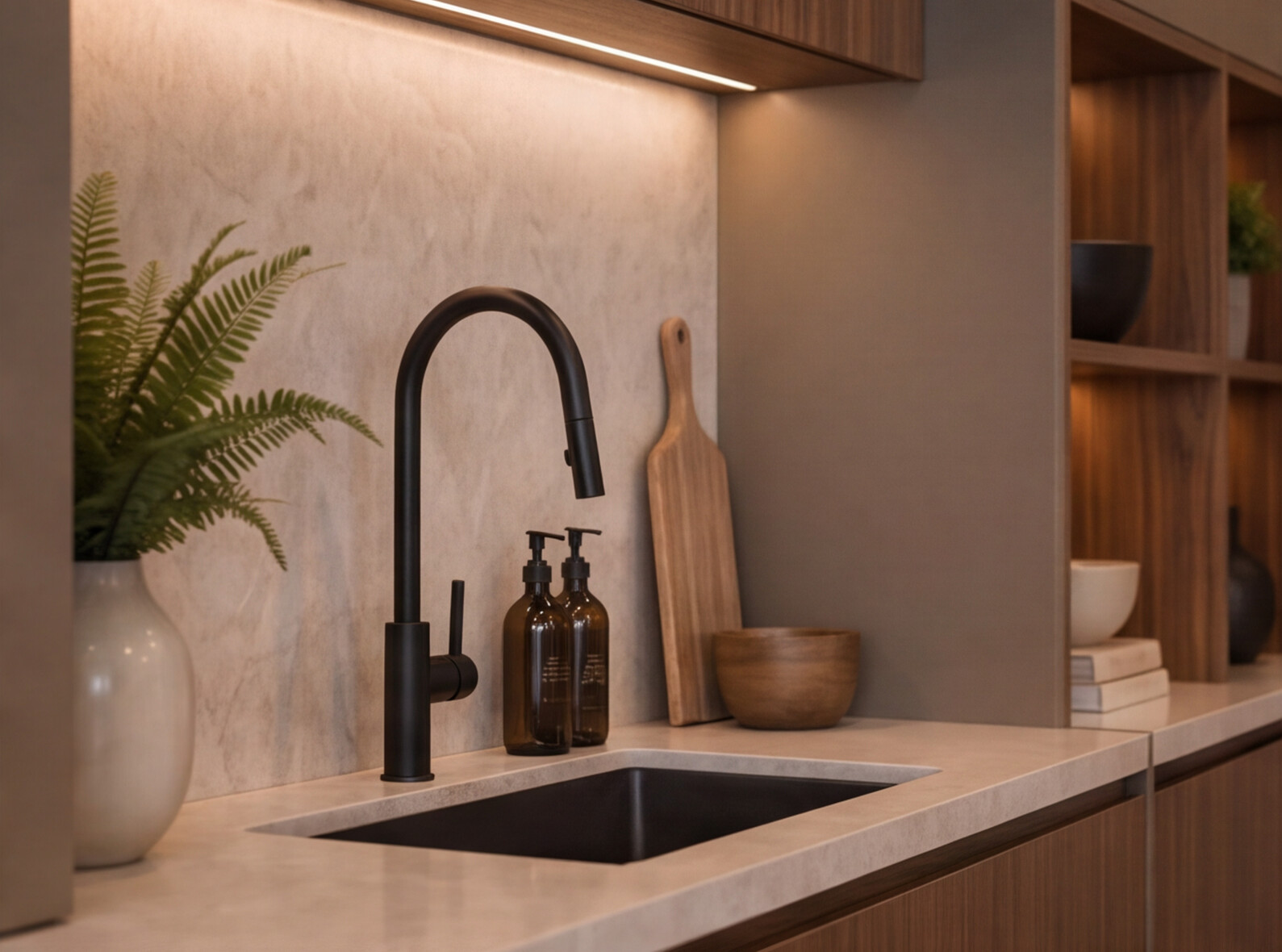
- Under-cabinet task lighting to keep work surfaces clean and usable.
- Soft accent lighting within open shelving to highlight objects and materials.LIGHTING.jpg+1
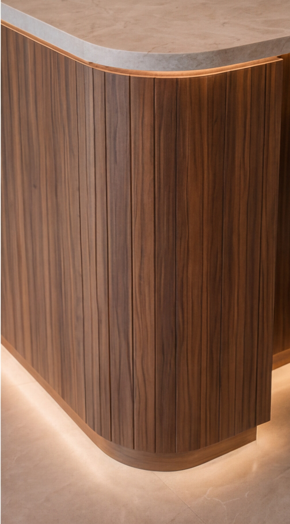
- A subtle LED line beneath the island base, adding a gentle glow at floor level.
- Recessed ceiling fixtures for general illumination without visual clutter.
Layering these sources creates depth and hierarchy rather than glare. During the day, the kitchen feels bright and efficient; at night, it can shift into a warmer, more relaxed atmosphere that matches how people actually use the space.
Details That Quietly Hold Everything Together
The small decisions in this project are where design, engineering, and manufacturing really meet. These are the details most people don’t notice individually, but they feel them every time they walk into the room.
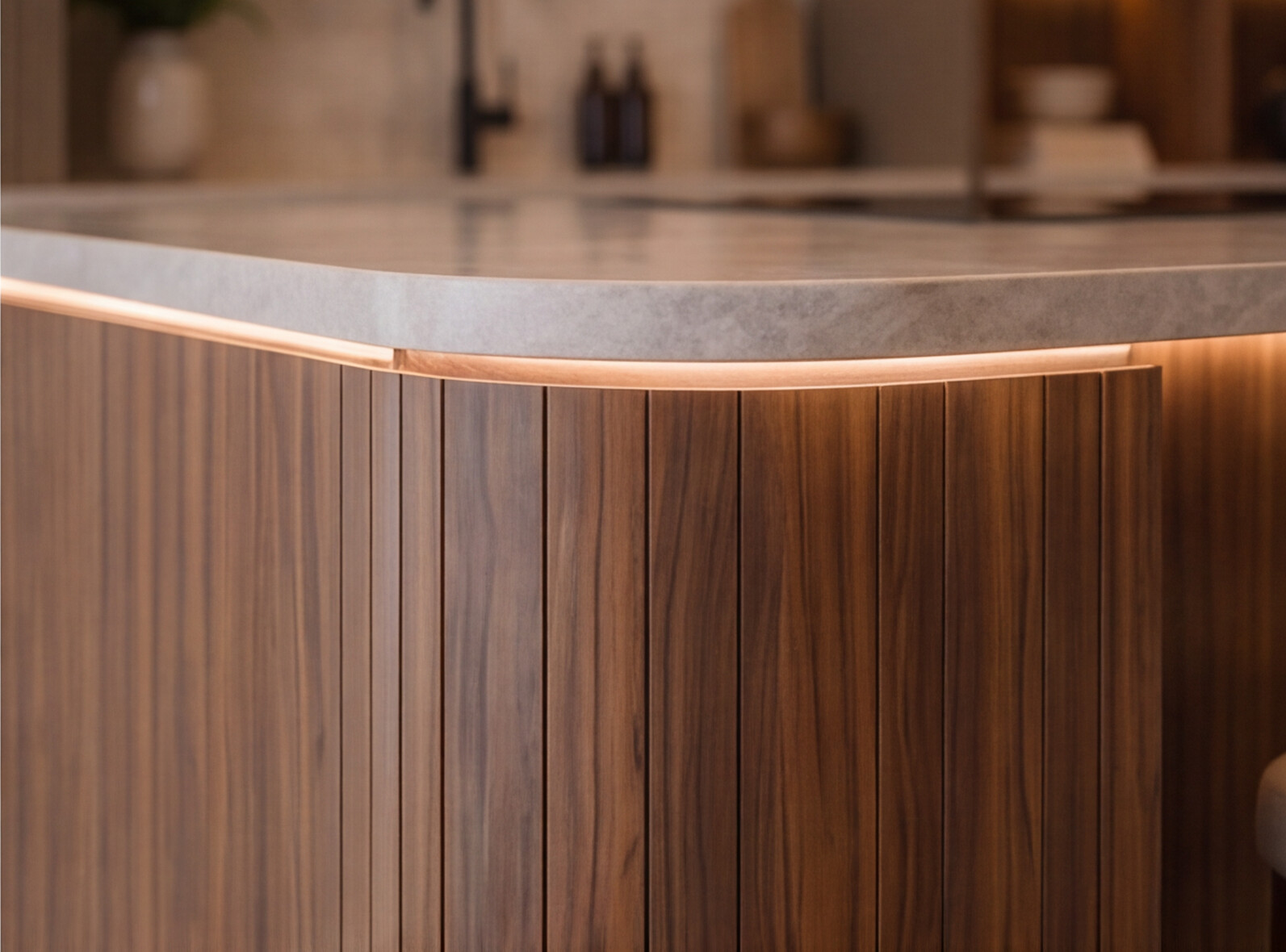
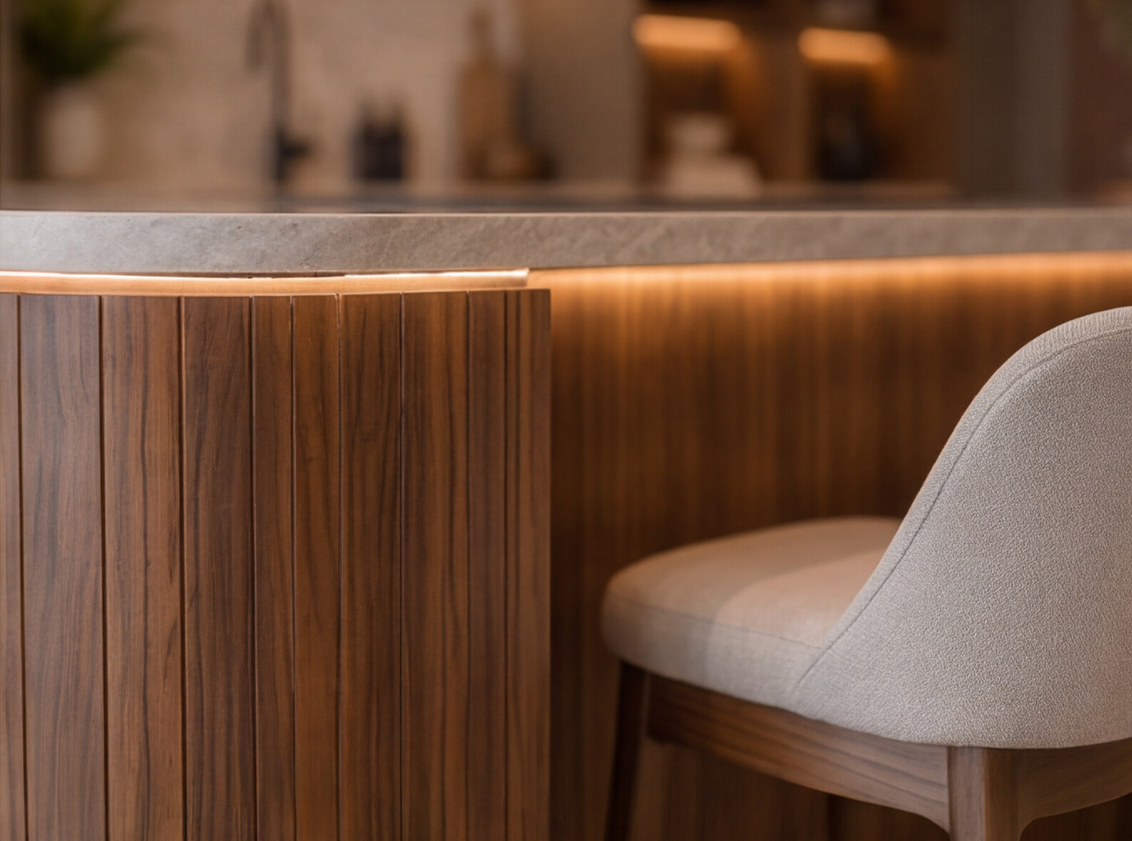
Rounded corners soften circulation paths and make the island feel approachable from every angle. Integrated pulls keep fronts clean and minimize hardware noise, relying on shadow lines and proportions instead of decorative handles. Consistent reveals and aligned joints across panels, appliances, and storage zones help the kitchen read as a continuous system rather than a patchwork of parts.DETAILS.jpg+1
This level of resolution only happens when engineering, shop drawings, and installation stay aligned from the first sketch through final fit. Great kitchens aren’t created by adding more—they’re created by making every decision work together.
Inside the Design: What Comes Next
This kitchen is the first chapter in our Inside the Design series, where we unpack the decisions behind well-executed interior systems. The takeaway is straightforward: start with a clear idea of how the kitchen should feel, limit the material palette, and treat storage, lighting, and appliances as part of the architecture—not add-ons that arrive at the end of the project.
Designed with intention, built with precision—that’s the standard we bring to every Maple Haus kitchen.